As I discussed in my previous post, Google’s huge mobile search algorithm update is just weeks away. Who will win? Who will lose? Who is born to sing the blues?
If you’ve been pondering a responsive web design for the next build of your site, you’ll want to expedite your timetable. And if you’re still debating whether to build a dedicated mobile site or a responsive site, that debate is over, too. More than a year ago, Google crowned responsive web design the winner, if organic search is important to your business, that is. If organic traffic isn’t terribly important to you, then you might be better off with a mobile site. It all depends on your audience’s needs.
While there will likely be some clear winners and losers, you don’t have to be “that guy” who lost all of his mobile search traffic. There are ways to develop a mobile-friendly site fairly quickly. Heck, if you start now and work around the clock, you might even make it ahead of the April 21 deadline!
So what’s the fastest, best way to build a responsive site? Below are our top three recommendations based on recent client experiences. While these solutions are great for some types of businesses, especially small-to-medium-sized variety, they may not be appropriate for truly large, enterprise-level sites.
Bootstrap
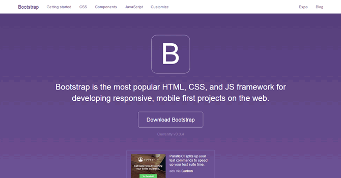
Bootstrap is an open-source front-end framework with mobile-optimization built in. It started a few years ago as an internal project by Twitter developers and has grown to become one of the most popular responsive frameworks. Just apply your programming logic and connect it to your database, and you’ve got a mobile-friendly site. You can expedite the process even further by buying and customizing a professionally designed Bootstrap theme from sites like WrapBootstrap for a ridiculously affordable price.
WordPress
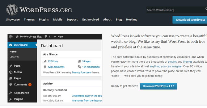
WordPress is by far the most popular content management system in the world. It powers almost half of the top 10,000 sites on the web; that’s how enormously popular WordPress has become. Like Bootstrap, WordPress is fully responsive, and you can buy and customize professional themes from theme marketplaces like Themeforest to speed up your site’s design. Unlike Bootstrap, WordPress is a robust content management system that includes all of the necessary programming code and database control. There are hundreds of professionally designed themes for under $100 that can be customized with relative ease if you know how to customize a theme’s CSS.
Magento
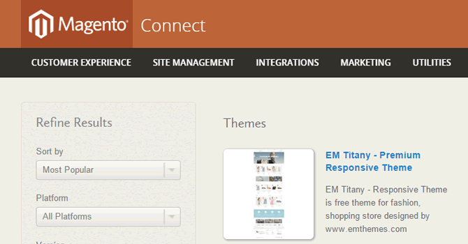
Even complex ecommerce platforms like Magento have theme capabilities, and there are many responsive themes to choose from on sites like Magento Connect and Themeforest.
Other good sources for responsive themes for all three platforms are Creative Market and Template Monster.
Which Option is Best?
Here are some general guidelines to help you settle on a mobile-friendly website solution:
• If you need complete control over your site’s code and have sufficient development resources, Bootstrap is probably your best bet.
• If you need full-featured content management capabilities and don’t want to code from scratch,WordPress is your choice.
• If you’re already running an online store with Magento, try one of the newer mobile-optimized themes.
And if you’re in the market for a new website, Page Zero just so happens to offer search-friendly website development services!